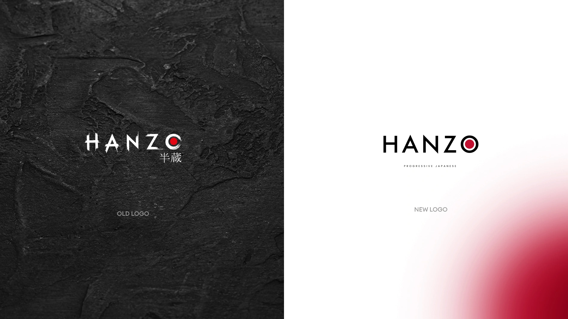
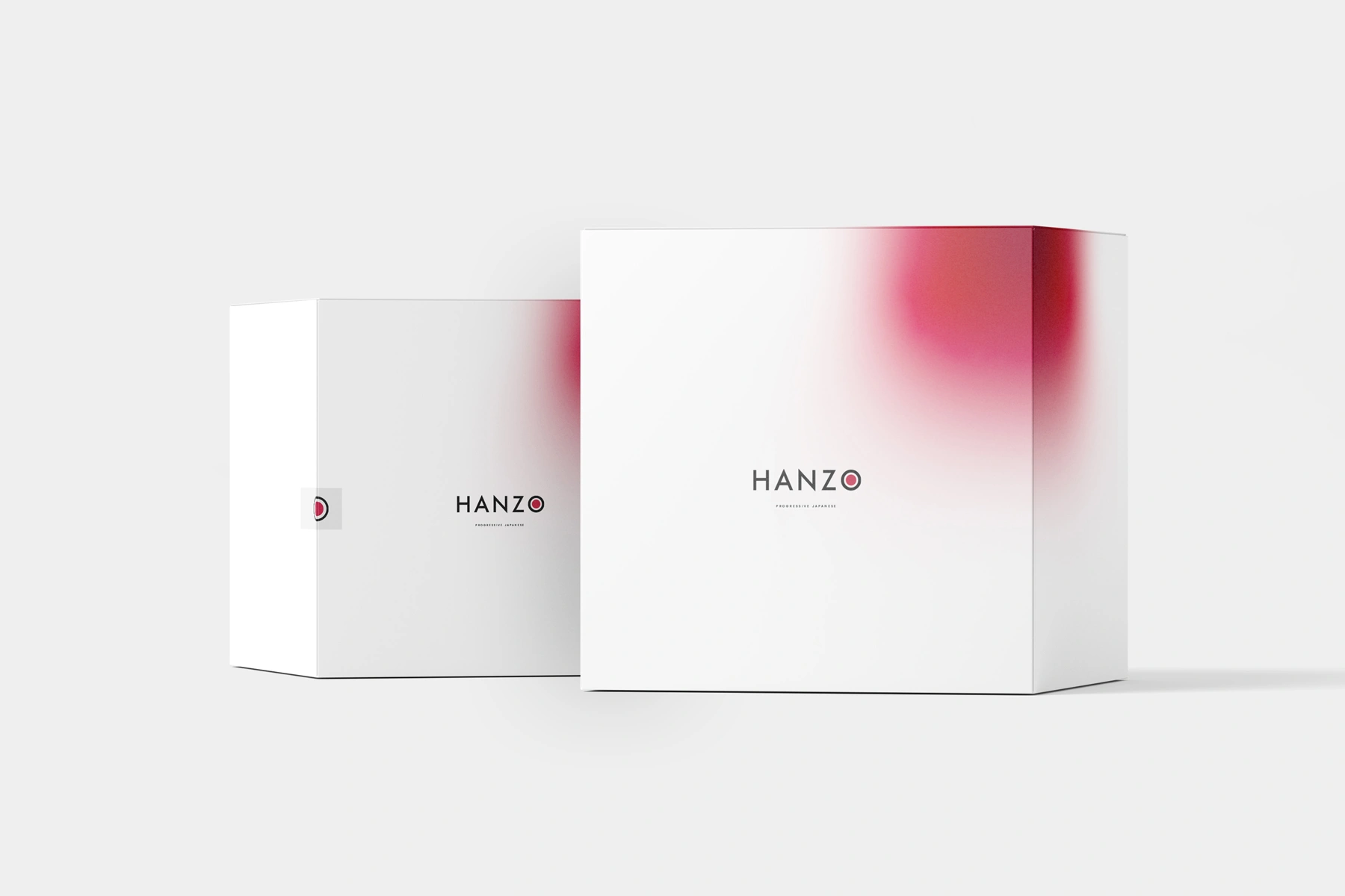
Hanzo is a Japanese fusion restaurant brand defined by a design approach that balances contemporary minimalism with cultural richness.
The project brief called for a refreshed identity that feels modern and sophisticated while preserving the brand’s Japanese roots.
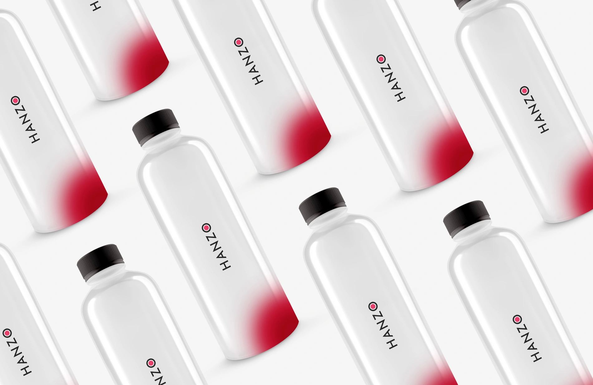
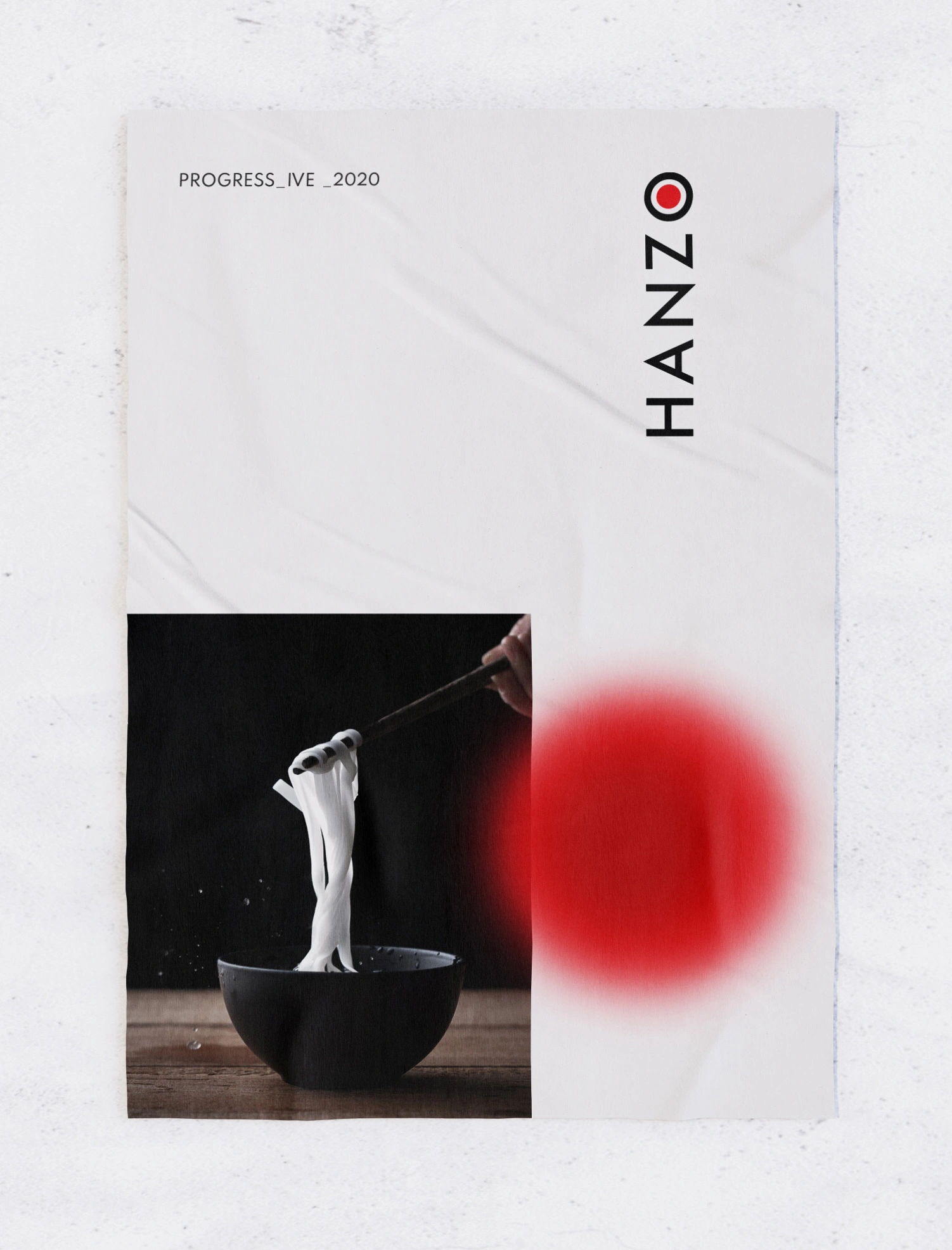
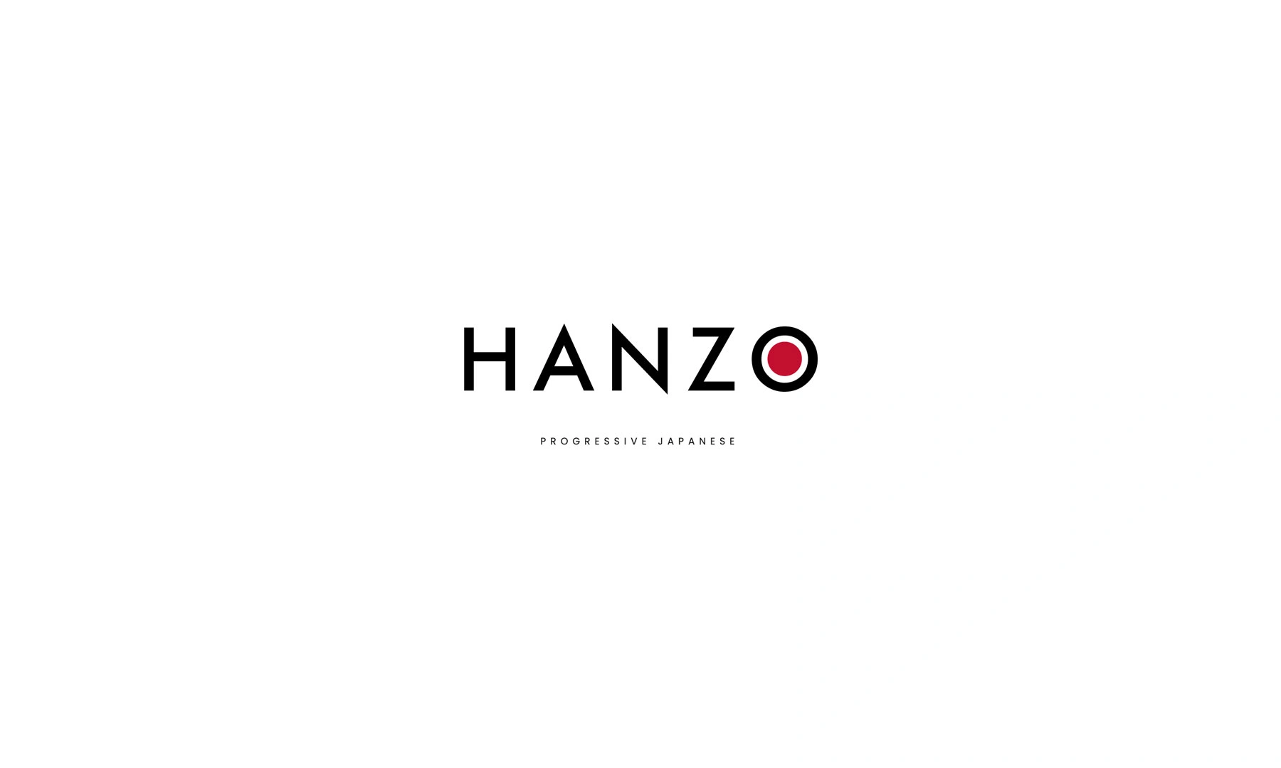
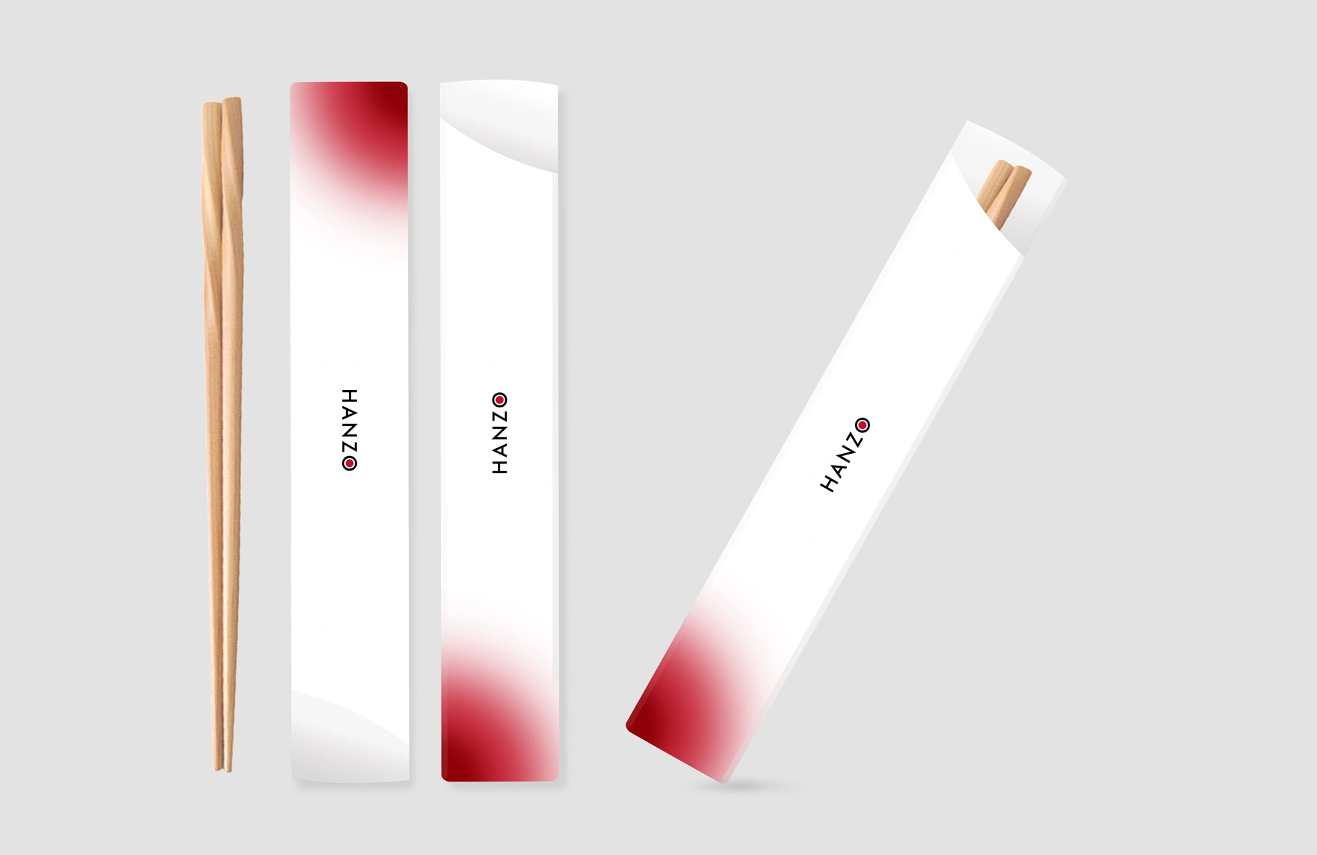
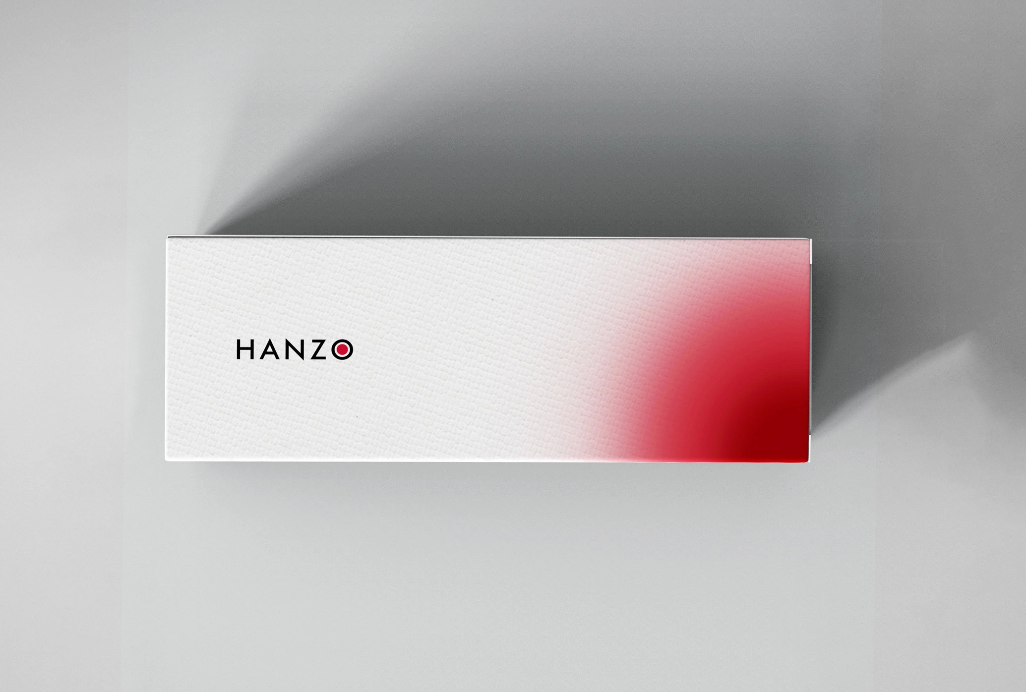
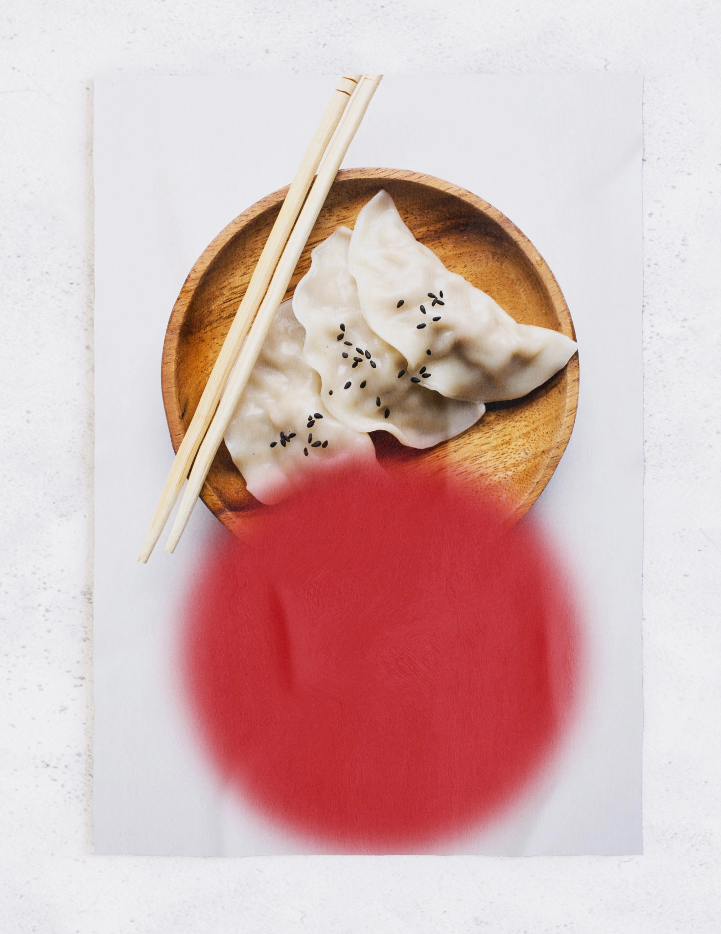
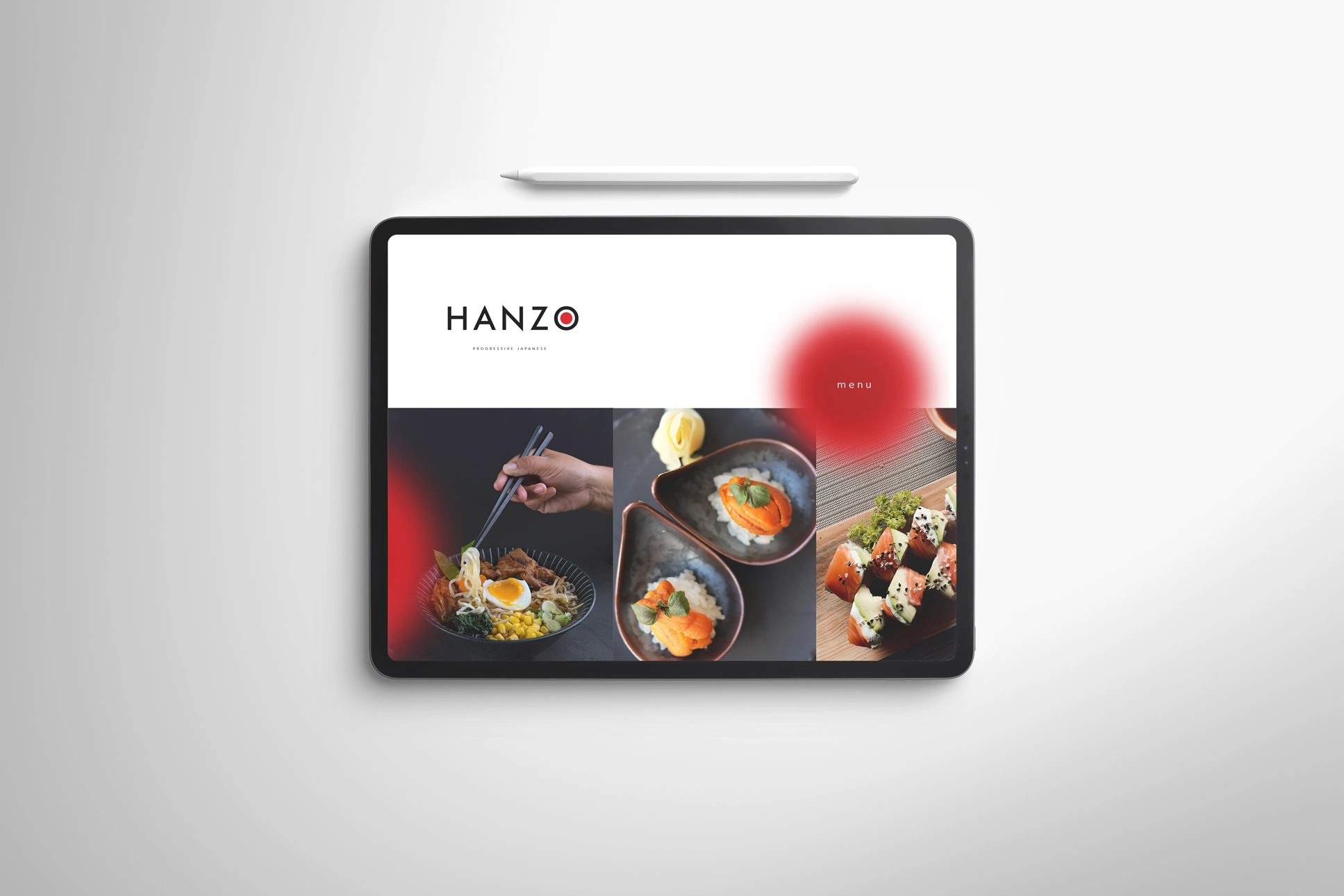
A sleek primary wordmark was developed with clean, geometric strokes for clarity and impact, complemented by a secondary mark inspired by traditional Japanese calligraphy for authenticity. Both are supported by a refined brand symbol and a balanced palette of deep tones and muted neutrals, creating an elevated dining impression.